THE CREATION
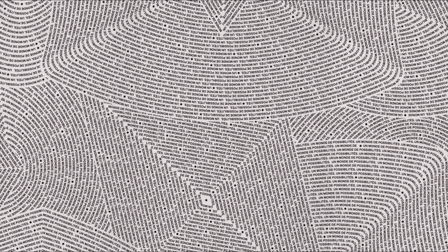
The phrase Un Monde de Possibilities was devised as a guiding brand principle and stamped into the foil neck of the bottle as a tribute to the brand’s French heritage. We arranged it in a guilloche pattern, similar to that found in passports, to evoke a sense of journey.
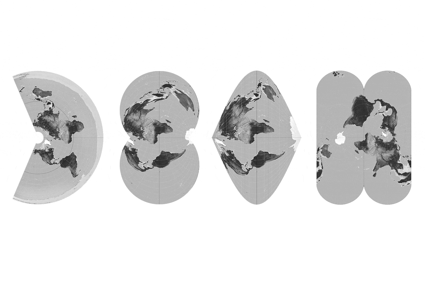
Then - adhering to the same theme - we explored designs based on map projections; the different ways mankind has tried to render our spherical world on flat paper. We put these map projections at the heart of our design, to suggest the prisms of perspective through which we view the world – and the adventure and discovery that follow.
The brand’s colour palette takes direct inspiration from Cosmic Latte or Skyvory — the colour of the Universe that was discovered by astronomers who surveyed the light from 200,000 galaxies.
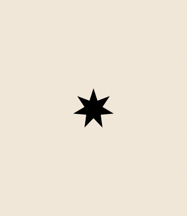
In the past Chandon was represented by a shooting star but, for its future, we felt this was too fleeting. We created a rising star that represents something that’s constantly evolving. The Chandon star also has seven points, one for each of the world’s continents, ready to be discovered.
Paying homage to the new rising star - the wordmark CHANDON was arranged vertically on the bottle to suggest looking upwards towards the night sky.
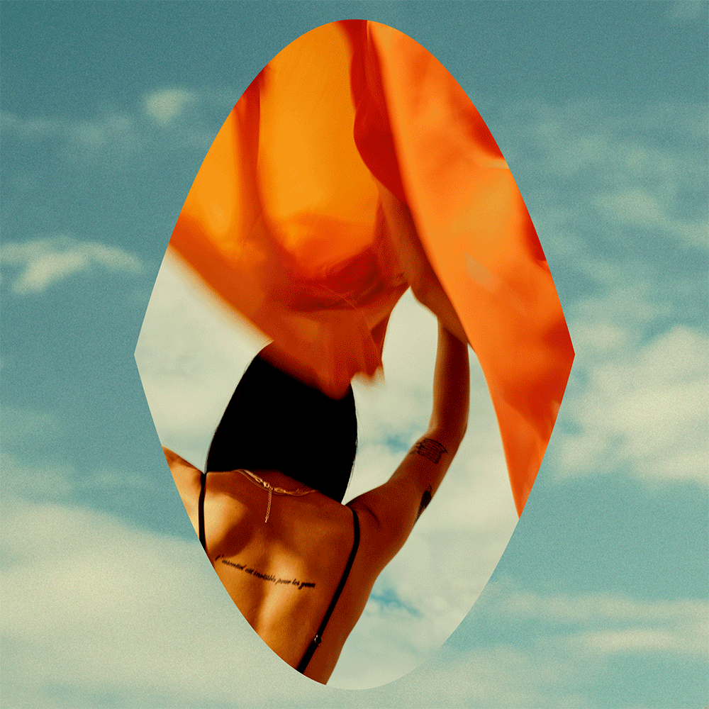
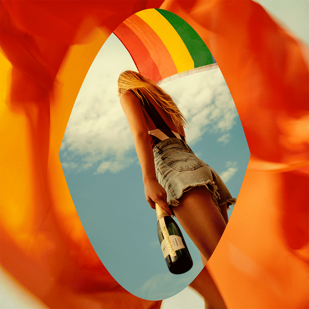
Finally, we worked alongside creatives in each of the key markets - Australia, Argentina, Brazil and California - to produce bespoke campaign assets which captured both the new brand codes and the freshly-uncovered spirit of possibility.
Discover the campaigns here.
THE IMPACT
Our work for Chandon resulted in one of LVMH's most successful rebrands, with positive uplift across revenue and reach. In 2023, Chandon was named the third most valuable wine brand in the world (Brand Finance).