THE CREATION
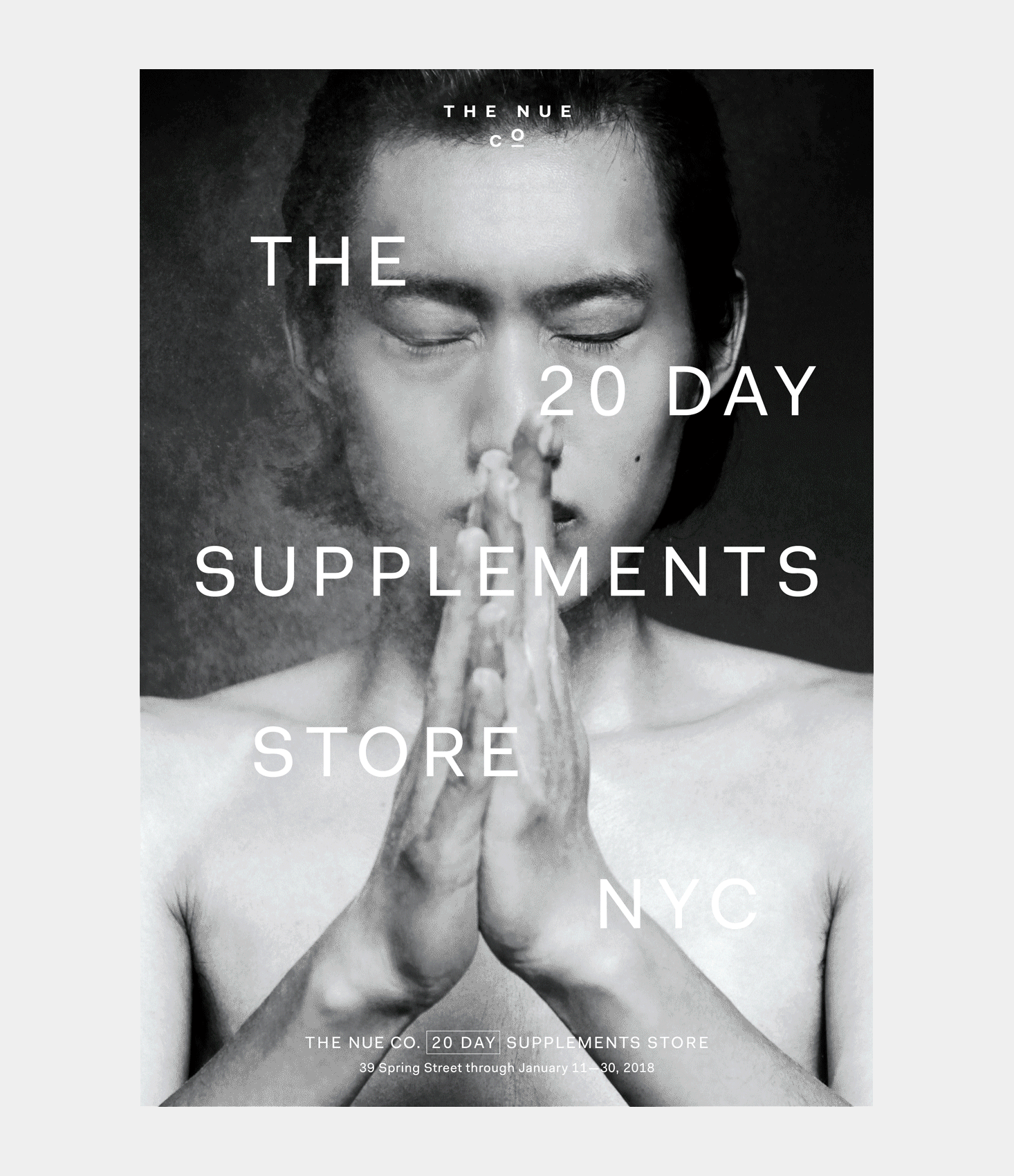
The Nue Co. is firmly grounded in scientific research, which is important for this product class. But science can feel opaque to the consumer — so we devised a visual language that came from science, but articulated through a lens of storytelling and familiarity, with playful and ownable elements haloing key information. To keep that playfulness elevated, it was embedded in reassuringly clean typography and lines.
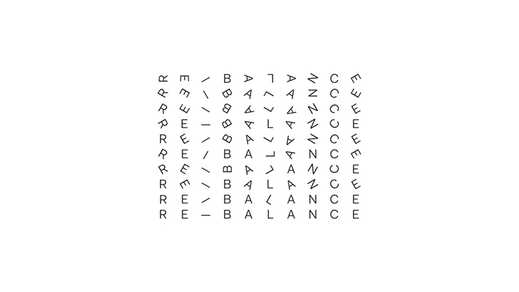
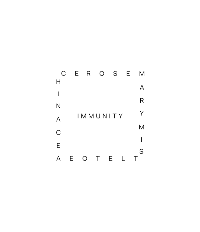
At the core of the work were moving poems: where the layout of the words communicated as much as their literal meaning. This enabled us to give customers an immediate and intuitive sense of the product before they’d even got to its description, whilst establishing a playful and surprising visual handwriting.
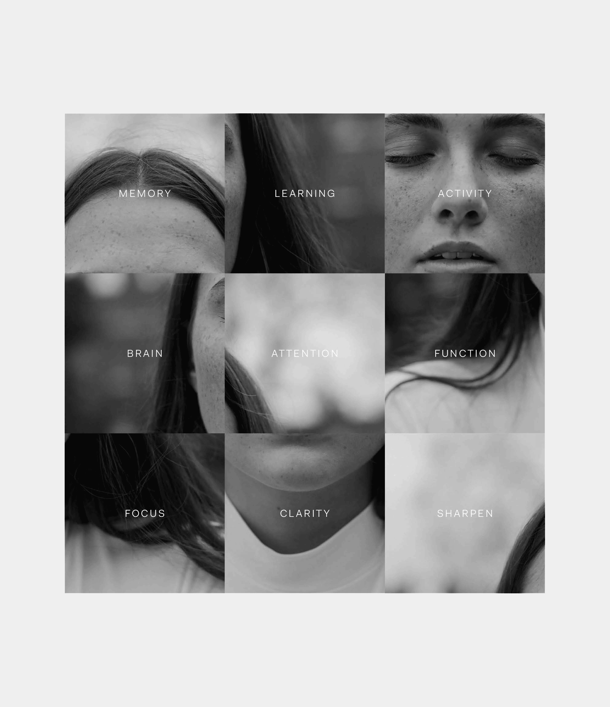
Photography also did a lot of heavy lifting — the distinctive black and white portraiture created a tapestry of campaign assets, with careful use of blurring and clarity to direct consumers to end use, and animations which disassembled, muddled and reassembled photographic fragments to symbolise disordered minds being brought into focus.
THE IMPACT
The Nue Co. launched to market in 2016 and has continued to grow both its direct-to-consumer and wholesale business since, with many successful product launches and expansion into new markets — notably the US via Sephora. The Nue Co. was named one of Fast Company’s Most Innovative Companies in 2023.